How We Designed Dead Planet
July 29, 2018 horror mothership scifi rpgs modules dead_planet
At Gen Con we’re going to release the first module for Mothership, Dead Planet. Donn Stroud, Fiona Geist, and I wrote it and it’s got some beautiful illustrations by Stephen Wilson.
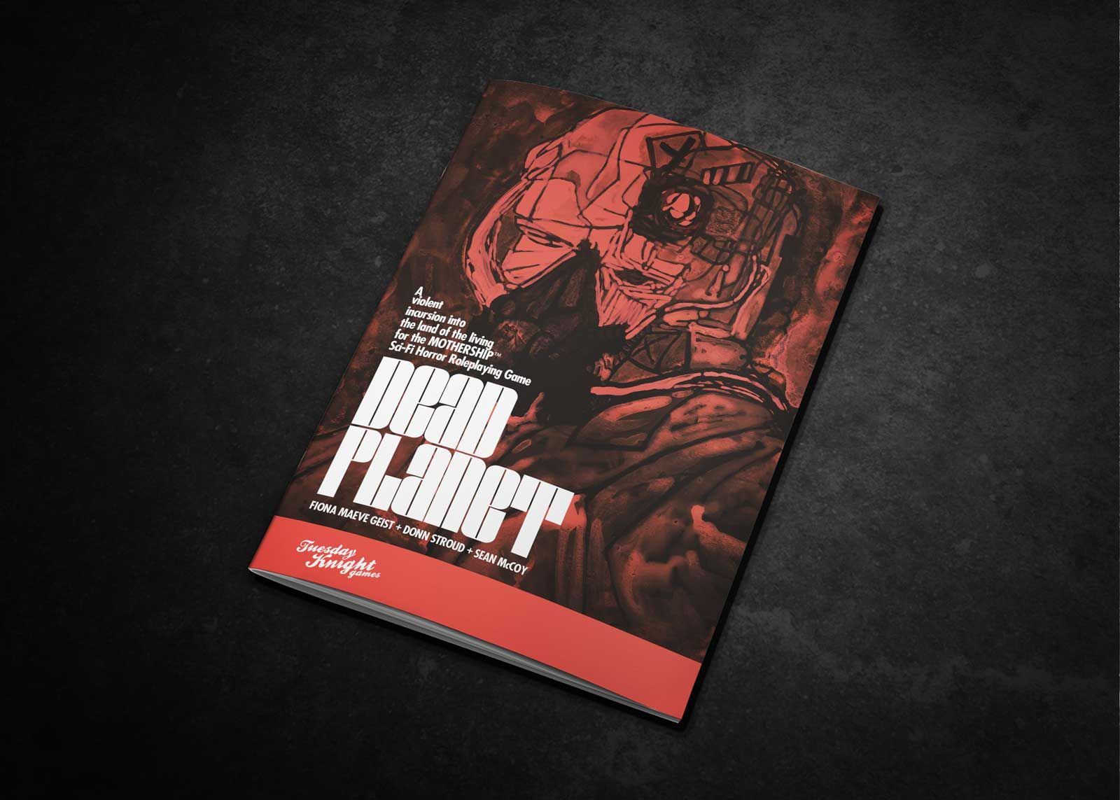 Cover
Cover
Dead Planet is about a strange planet that sucks ships into its orbit from hyperspace and then traps them there because of a Gate that feeds off the jump drive energies (its entire orbit is cluttered with derelict ships). The gate was created a long time ago by creatures called the Gaunt from the Dead Dimension.
Dead Planet Features
It’s 48 pages long, full color, saddle-stitched, zine-sized and man did we pack a lot into those 48 pages, including:
- A gridcrawl of the main island on the Dead Planet, five main locations and encounter tables, including a giant Necropolis (and a random generator for its buildings), and the Red Tower, an insanely dangerous five level underground bunker complex overrun with Gaunt.
- Another gridcrawl of the Dead Planet’s moon, complete with ritual cannibal colonists, an insurrection attempt, and a table for compulsively sculpting.
- A detailed adventure onboard The Alexis, one of the drifting ships in orbit around the Dead Planet.
- A table of one hundred nightmares (this one is incredible and worth the price of admission alone).
- A generator to create derelict ships.
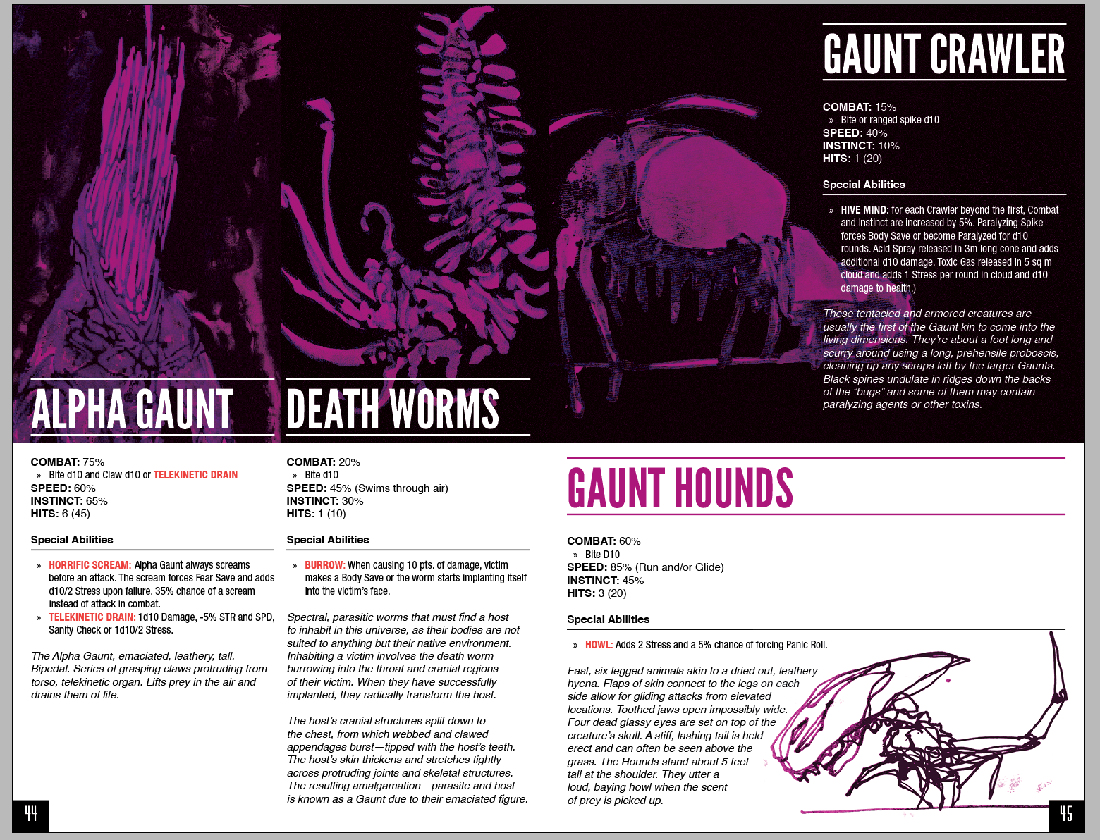
- A small bestiary of creatures.
Basically:
Information Design & Layout
Much of the content is thanks to Fiona and Donn’s incredible writing (Jarrett Crader and Fiona handled the editing as well, so it’s terse as fuck), I spent most of my energy on experimenting with the layout. It’s a small zine size so right away we threw out stuff like comfortable margins and line height and font size in favor of MAXIMUM CONTENT PER PAGE. Some examples below.
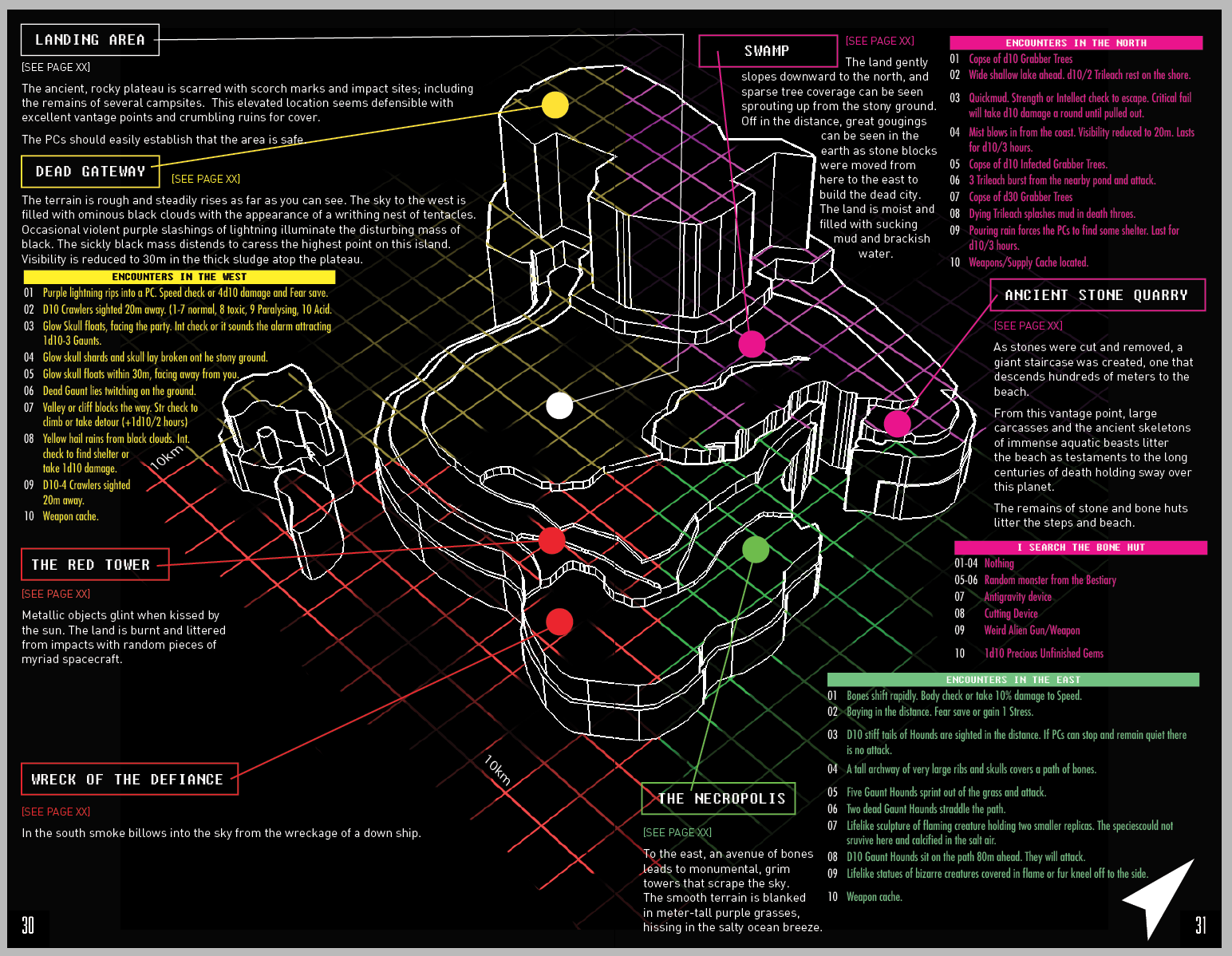
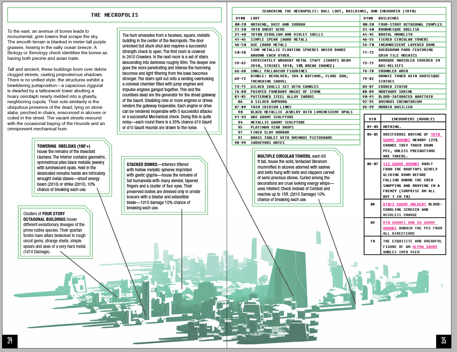 The rough for the necropolis. One of my favorite spreads. This one doesn’t need a detailed map, it just needs a general image to give you the idea of what you should be going for. A few keyed locations, a good generation table.
I did a thread on twitter tracking along with the layout and graphic design and that picked up some decent traction. Take a look if you want to see more examples of the work in progress.
 Rough version of the world map. The colors of the different regions correspond to the colors of the pages referenced.
The big thing was we tried to make everything into a spread that we could imagine a Warden looking at during play. We wanted to keep page flips to a minimum. Or to keep page flips to natural breaks in the game. Everything that can, has a map or an illustration or a diagram or a table — just something to put the idea in your head during play to make it easy to describe to your players. The colors are loud loud loud because I wanted flipping through the book to be easy, the whole thing is essentially color-coded. With different colored sections on the map corresponding to different colored sections of the book. It’s lousy with experiments like that. Some work. Some might not. But for me, usability is the hill to die on.
Where Can You Get It?
It’s $15 at Gen Con in booth 2051 (the Tuesday Knight Games booth), with a PDF version coming soon after. I’m adding some more to the PDF version (which will be free for those who buy it, it’s got instructions on how to get the PDF inside the book) like downloadable blank versions of the maps for players, top down versions of the maps (in case our 3D is annoying to you, etc.). Stop by and pick it up, we hope you enjoy it.
Also - you can still get the core rules for pay-what-you-want.
Edit: They’re in! They look amazing. Here’s a flip through:
Previous post
Screaming on the Alexis: Session Report [Mothership]It’s been a little bit since we got to play, but last night everyone mysteriously showed up ready to game - it just so happens that we’re trying to...
Next post
Notes From Gen Con 2018Just got back home from Gen Con, which is always a little like getting back from summer camp. Historically, my con scheduled used to slow down after...
Copyright © 2018 Failure Tolerated